Wednesday, May 25, 2011

CHARACTER DEVELOPMENT

Today I started with the character development....
Tried and explored a lot of things. Few of them are here...


Monday, May 23, 2011

TUTORIAL

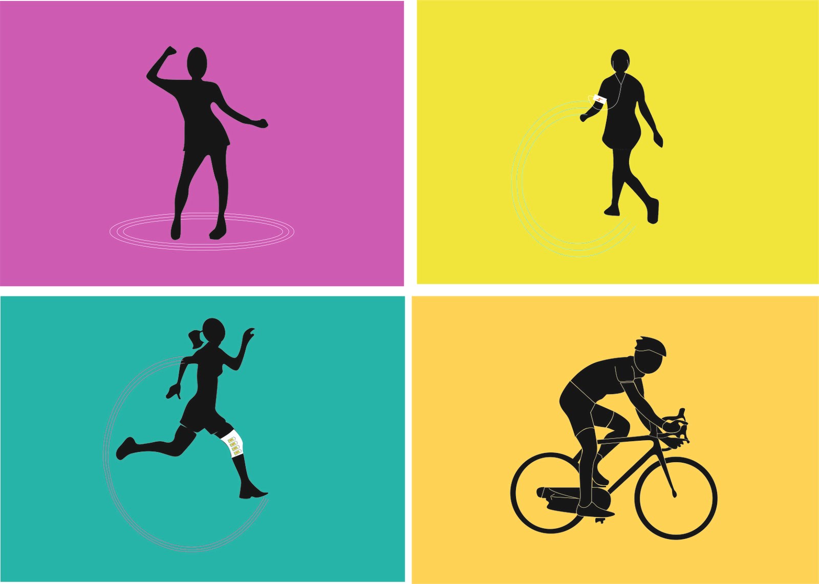
I started exploring the visual language for the infographics keeping in mind simplicity and playfulness of young children.

GEOMETRIC, UNCOMPLICATED, STRAIGHTFORWARD, EFFORTLESS.
These were the four words I could think of when i thought of young children. My initial explorations revolve around these expressions.


Man with Football


Man with football

People playing football


When the football is batted about.
For todays tutorial I had few questions in my mind:
1) What should be the art style for young children?
2) Will children understand such technicalities which my narrative offers?
3) Also I need to get my narrative of the movie checked from my tutor


FEEDBACK(and answers):
My tutor suggested me to develope characters and not use isotypes. He asked me explore the visual language of my audience in more depth. Also according to him my story didnt have very complex technical information which children would not understand.
So for the next tutorial i have to develop a character for my movie and visualize the five situations i.e playing football, typing, dancing, railway station and body parts like lungs.

Saturday, May 14, 2011

Paper Info-graphics-Part-2


This promotion set includes book, bookmark and poster was designed to 
introducing Taiwan. 
It is not only a book with a bunch of nice delicate paper-illustration, but 
also an informational graphics book. I translate some normal facts into 
interesting numbers, and then use paper-illustration to make the 
informational graphics.
Why
When I came to the United State, I noticed that many people don't know 
my hometown Taiwan. Some people even cannot tell the difference between 
Taiwan and Thailand, just because they sound alike. As a designer, I think 
I should do something to promote this beautiful island.
Challenge 
I would like to do something very different from the other books about 
Taiwan. It would definitely not be a tourist guide, nor a boring government-
published book. It should be interesting and casual, but also clear in 
delivering the information about Taiwan. 


http://www.behance.net/gallery/Ilha-Formosa/1339213


The population of the mainland China is 59 times than
Taiwan. If mainland China's population is the whole dish,
Taiwan is just one piece of chicken. (This dish is one of the famous Chinese dish – Kong Bao Chicken)


Its quite interesting how the designer here has shown the graphics through paper illustrations. 

Paper Info-graphics

Pattern making is not new, but creating info-graphics by the means of patterns is quite new and exciting. Patterns have always been used as decorations or art  pieces but a pattern which holds a meaning and communicates something is remarkable. I came across few of these:


Pattern Matters, a graphic design-based project inquires on possible ways to augment the role of pattern . It demonstrates the way of how this design element of pattern can be adopted differently on various platforms in graphic design. The main objective of this project is to inspire designers to look at pattern in every possible angles. Pattern Matters also aims to demonstrate that pattern is a crucial form of design element in graphic design which eventually evident that pattern is not merely a decorating tool.(http://www.pattern-matters.com)


World in Miniature, What Is Your Name (most common names in St-Petersburg, Russia), Business Plan (TV power consumption)
Paper infographics by Dmitriy Gorelishev (Дмитрий Горелышев) are made for a various Russian newspapers and 'Infographics' magazine.


Source:
http://gdmitry.livejournal.com/tag/Инфографика
http://infografics.livejournal.com/


Handmade Visualization Tool-Kit


Today I came across a Colombian designer Jose Duarte who created a Hand-made visualization tool-kit.
To explore new and simple ways to represent information he made his own visualization kit-tool that allows him to make any kind of graphics quickly. The survival kit consists of various small objects with which you can make any kind of graphics including: abstracts maps and diagrams, area graphs and charts, arrow diagrams, bar graphs, Venn diagrams, time line charts, bubble graphs, circle diagrams  proportional charts, organization charts.


Hand made visualization tool kit is an alternative way of presenting information. Its a hands-on experience which uses various basic materials like balloons, wire, sticks etc to show maps, diagrams, charts arrows etc. 
Feels as if the information is on the move by the way of this tool kit and can be shown in different ways and in different situations. 
INTERESTING!


Source: http://infosthetics.com

Wednesday, May 11, 2011

DATA VISUALIZATION-3D

Is peace a question of Money?

I was exploring the different mediums of presenting data visualization. One of the medium which i looked at is 3D installations.

The 3D installation below has been created by Uta Hinrichs from Lubeck in Germany.It shows the relation between the wealth of a country(gross domestic product per capita; GDP) and its peacefulness(global peace index; GPI).

The GPI uses 24 indicators that can be categorized into militarization, societal safety and security, and ongoing domestic and international conflict. Countries are assigned a score between 1=peaceful and 5=less peaceful. The data assessed in the year 2008 include 140 countries.

In the visualization, each country is represented by a cylinder made out of paper. The GPI score of a country is mapped to the height of a paper cylinder. The shorter the cylinder, the more peaceful the country according to the GPI data set. The area of each cylinder represents the GDP of the according country. The more area a cylinder takes up, the higher the country's GDP per capita. Cylinders are roughly arranged according to the geographical location of the country they represent and are labeled with the country name to ease comparison.

The visualization shows that cylinders tend to be wide and short or narrow and long – peacefulness seems to be a matter of wealth. Furthermore it gives an overview of the geographic distribution of peace and money. For example, countries in the northwest appear to be richer and more peaceful.


SMALL TEXT LABEL-showing

the names of the countries


There are some things which I like and somethings which i don't understand about this 3D piece of data visualization:


THE GOOD:
  • Comparison: Comparison is made easy with the use of two variables i.e. height and space. The cylinder's height represents the GPI score(the shorter the more peaceful) and its area or space shows the GDP(the more area, the higher the GDP)
  • Positioning: the positioning of all cylinders based on the geographical locations of all countries help the viewers to draw conclusions as to which part of the world is more richer and peaceful and vice versa.
  • Simplicity: Minimalistic use of shape, color and material makes the data effortless to understand. 
THE BAD:
  • Confusion: The minimalist difference in height and space is hard to understand as there are no actual numeric values mentioned
  • The designer here in his blog has not mentioned where will this piece be used. And so i am not able to figure which kind of audience has he made it for and where will it be displayed.  
Overall a very different and new way of presenting the information which will definitely grab anyone's attention.


Monday, May 9, 2011

TUTORIAL- Visuals finally!!!

I had been developing visuals all this while . And had a lot to show in todays tutorial.These are few of the initial concepts:
PAST: Dinosaurs, forests and underwater
animals died and were converted into oil,
coal and gas 
Energy produced by Dancing, walking, running, 
cycling etc can be reused to produce power

FEEDBACK:
My supervisor asked me to expand the initial ideas more. More detailed information is needed to explain the future forms of energy. He asked me to focus on 5 facts and visually explore them and experiment with a variety of ways to display them for the audience. He asked me to story board if necessary to figure out how the movement would work. Also more visual development is needed.
My supervisor said that these visuals are more like illustrations and i need to expand them and show more detailed info-graphics.


JUST A THOUGHT:
Can these info-graphics be used at the places where they can be viewed by the audience. Places where young teenagers usually hang around.
Parks, Computer lab, Playing ground, School canteen, cycle stand etc.
An info-graphic which talks about how energy produced by typing can be used to charge the laptop batteries, can be put up in the school's computer lab and than it directs the viewer to the full movie.
I discussed it with my supervisor but he suggested me to first come up with visuals.


The improved Brief -feedback

So finally I get an email today saying that i have passed my MA referral brief. This news boosted my spirit and i was confident that i would be able to move my project further in the right direction. I will obviously need to work harder and require more guidance and feedback.


FEEDBACK :
You have taken on board what was asked of you within the referral brief. The submitted report now clearly states your intentions for the project with a clearly redefined and written brief. It gives an overview of past, present and future recycling trends and requirements.

The case studies you have sourced support your ideas about the subject matter, giving an indication of the practical outcomes experimented with using kinetic and potential energy as its core power source. You now have a more unique angle to explore on the broader subject matter of recycling. You have evidenced your sources and reinforced your arguments for conducting the project.

Think about how much you focus on the past and the present in your project. Perhaps this should provide the context for the future. I would think about using the past and the present to tell the audience why we need alternate forms of recycling and then use the future to propose what those alternate forms may be.

You have come to some conclusions but now need to identify which audience you are going to focus upon. This obviously will have a bearing on what the outcome will become and which visual language will be appropriate.

You have analysed the criteria for each audience in some depth and it now feels like you understand whom you are designing for in much more detail. The identification of likes, dislikes and lifestyle habits of the chosen groups, should be of enormous benefit to you.

It should provide the foundation for you to design from. The big decision is which one will you pursue. Make this choice carefully but quickly as you cannot waste time.

In general you have completed the task given, however I would suggest that you should explore the visual language for your chosen audience in more detail to ensure what you produce as a final piece is suitable.

There has not been enough exploration of this so far and it is crucial that you get this right for the piece to be successful.

I undoubtedly had to few points in my mind about what I had been doing and what I need to do after reading this feedback:

  • My supervisor wants me to focus more on present and future rather than past. I need to conceptualize my narrative in a way that it explains how the face of recycling has been altered in so many years wherein the past becomes the introduction and points towards the present and together they can lead to a conclusion pointing towards the future.
  • All this while after the submission of the referral brief i had been thinking about the audience and finally decided to go with the young adolescents(12-15 yrs old).This is the age when young children are learning new things and experimenting themselves. They are the today’s thinkers and tomorrow’s doers. Recycling is an important environmental issue and young children being the future of our nations should be well informed about the problems being faced due to growing waste and relevant solutions to conserve our natural resources and protect environment.
  • I started my research for the audience by identifying their likes, dislikes and personality and gathered all this in the mood-board. This definitely helped me understand my audience more broadly. 
  • Now since i have the content and the audience clear to me, i have to undoubtedly start with visual exploration.

Thursday, May 5, 2011


This video shows how in future apple will take over the world with its technology. Mingjai from China came up with this idea. This is not for real commercial but more of fun. I was drawn to this video because it relates to my own project to a great extend. It shows the present and future of Apple technology. The designer here shows how certain things which makes no sense for a phone to do, will be made possible in the future with the help of i-phone and the world will be called i-world.


Monday, May 2, 2011

INFOGRAPHIC: How do Americans feel about the Bin Laden mission?


The much awaited wait for America gets over today when Al-Qaeda leader Osama Bin Laden was killed by US forces in Pakistan.Bin Laden was shot dead at a compound near Islamabad, in a ground operation based on US intelligence, the first lead for which emerged last August.

Mr Obama said US forces took possession of the body after "a firefight". Bin Laden is believed to have ordered the attacks on New York and Washington on 11 September 2001 and a number of others. He was top of the US' "most wanted" list.
A joint USA Today/Gallup poll asked the American public how they feel about the U.S. mission to kill elusive Al-Qaeda leader Osama bin Laden. Do they approve of it? Who do they think most deserves credit?                                                                                                   The above info-graphic shows the survey done. The information is shown in the way of tables and graphs. The presentation is very systematic and clear.